New AP-HP hospital headquarters
New headquarters for AP-HP, Paris area’s public hospitals, on the site of St Antoine Hospital
As part of an overhaul of their overall organization, AP-HP, the health authority that runs 38 hospitals in and around Paris, is uniting its management teams from different sites in a new headquarters.
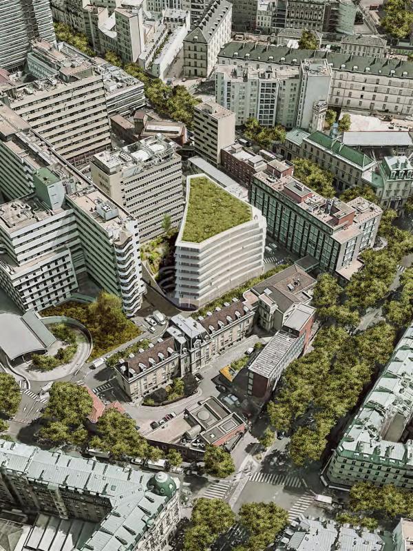
The project is to promote collaboration between different departments within one, new building on the site of the Saint Antoine hospital in south-eastern Paris, at immediate proximity to healthcare staff and patients. The program includes a number of common spaces for AP-HP staff: auditorium, cafeteria, collaborative work spaces, as well as a landscaped garden open to all staff members and patients on the site.
Designed by ChartierDalix, the project is led by CBC (Vinci). T/E/S/S is responsible for design studies for the facades and the geometric definition of the balconies.
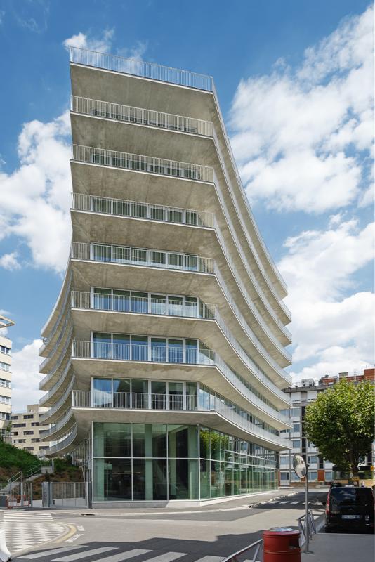
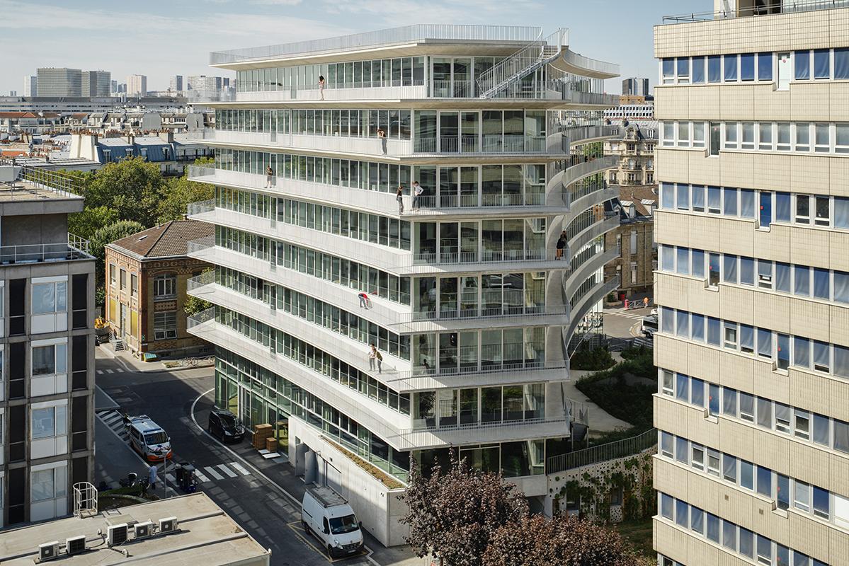
The site of the new headquarters is surrounded by tall existing buildings (G+10) and is already used extensively as a breakout space by hospital staff. ChartierDalix has proposed a very compact building, triangular in plan, with topographical landscaping around the foot of the building. This plan minimizes the impact on light levels to the surrounding buildings by distancing the facades and freeing up half of the site in order to maintain the garden for staff and patients.
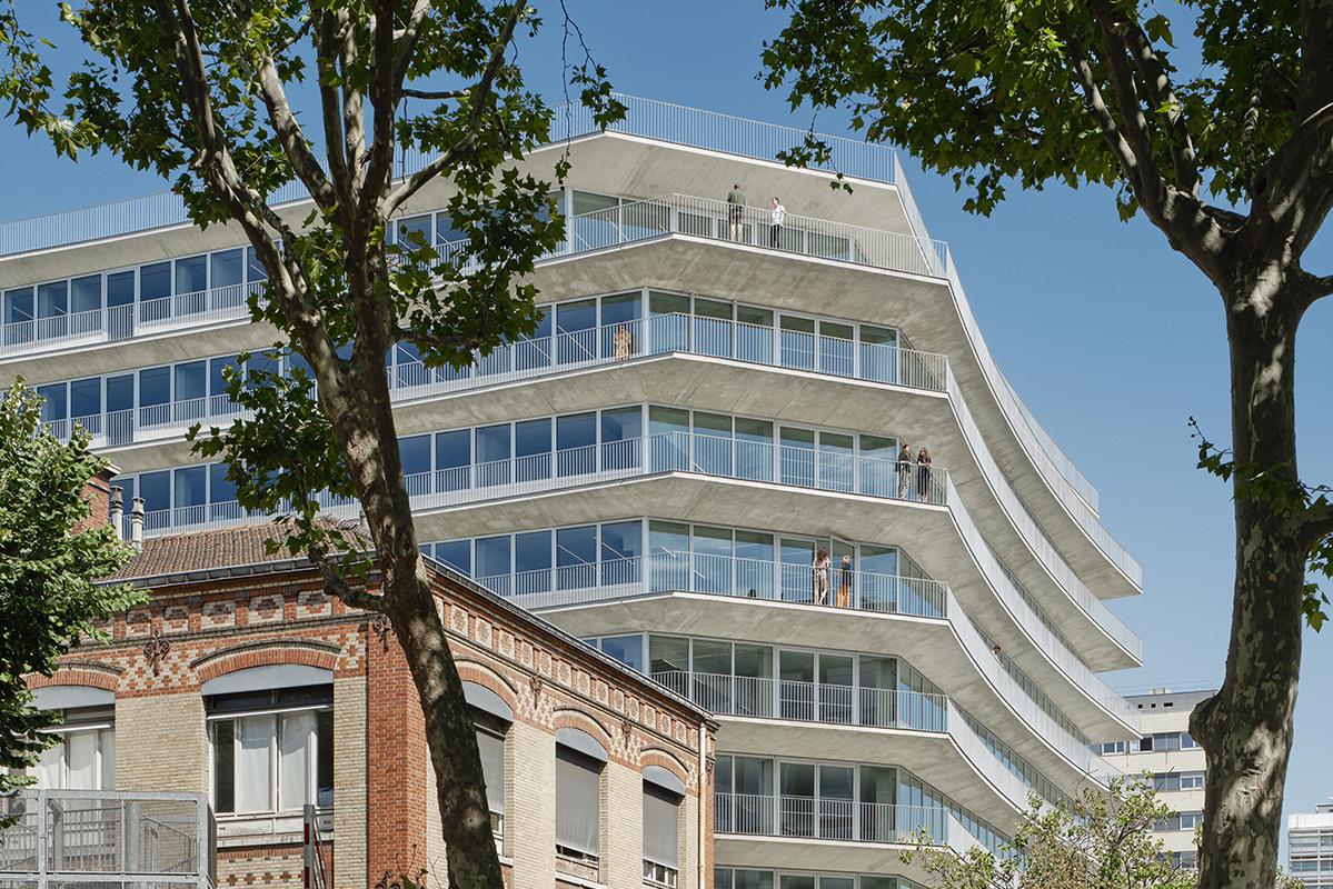
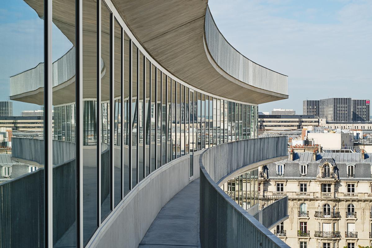
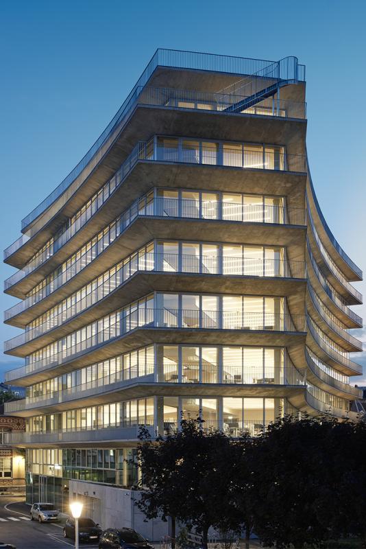
The triangular, radiating form of the building generates three branches that open up to link it to the outside. All the facades are carefully and rationally detailed: a continuous horizontal glazed band with balcony runs around the periphery.
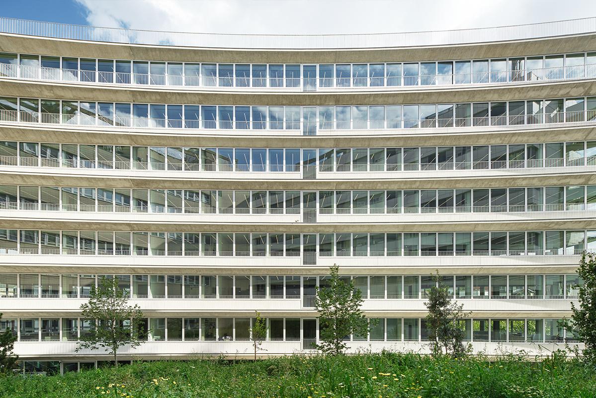
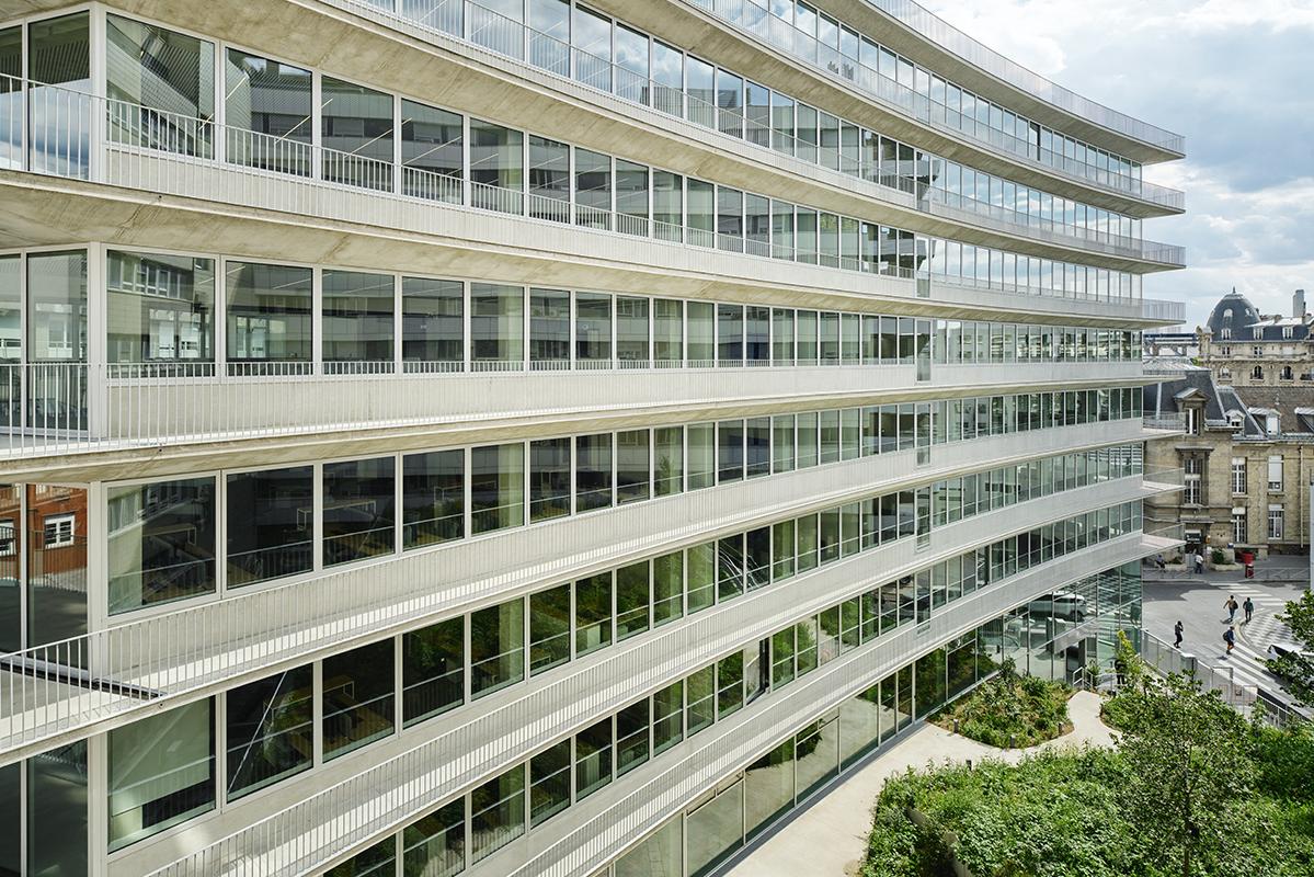
The facades and balconies define the overall geometry of the building. Each side of the triangle is slightly concave, which softens the building’s relationship to its neighbours and improves its integration. The three points of the triangle are truncated, creating a range of viewpoints and meeting areas on the balconies. On each level, the facades follow the same language of glazed frames in continuous bands flush with the external face of the precast concrete spandrel panel and double-curving balcony (slab edge and soffit) in raw concrete. The balcony is finished with vertical railings.
The height of the ground floor’s curtain-wall facade follows the topography of the garden. The strength of the project lies in its apparent simplicity; only four continuous elements – frames, spandrel panel, balcony, and railings – repeated at each level, define and reinforce the form of the building and clearly express the initial concept of the project: opening onto the immediate surroundings for the lower floors, and the city for the upper floors.

